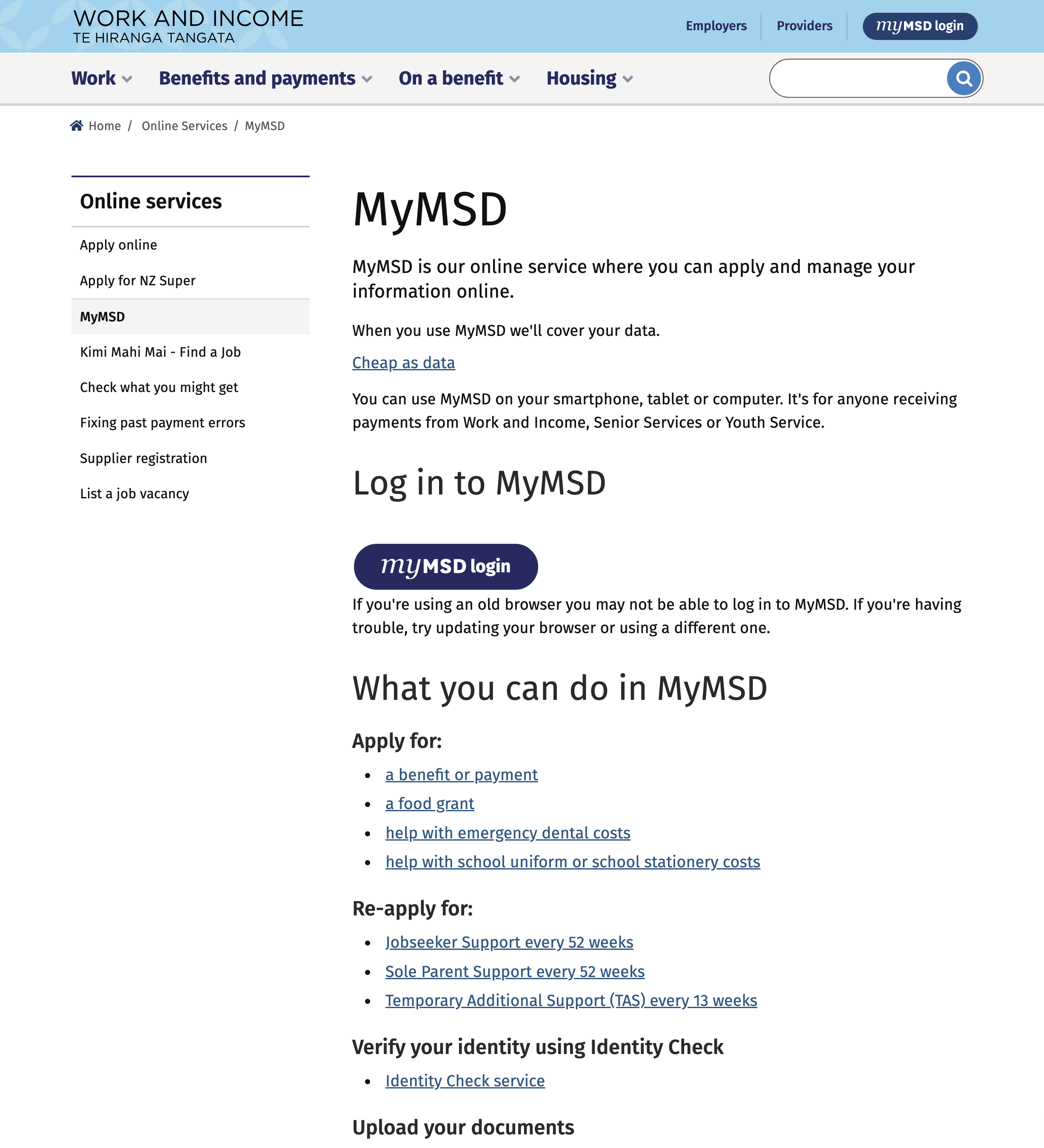
My journey with this project started while working with Ministry of Social Development when I was listening to one of the client’s frustrations around how the information has been scattered around everywhere and how they feel confused and overwhelmed when they land on to the MyMSD page. I thought this was only one person’s problem but after listening to thousands of users, realized it is a major issue. An idea was born while I was ruminating on possible solutions. There has to be some way to solve this and that was Agile.

Ministry of Social Development- Work & Income, New Zealand.
During my tenure at the ministry, I spearheaded a self-initiated project. As a product designer, my focus was on optimizing the client journey and enhancing their experience with the MyMSD app. My crowning achievement was mastering the design thinking process—empathizing, defining, ideating, prototyping, testing, and implementing—to deliver innovative solutions. The principle of 'less is more' and the brilliance of simplicity became evident to me. Embracing agility has become a way of life.
Confusing content
Problem
The primary issue was the dispersal of information across the website under unrelated headings, leading to considerable user confusion and frustration. My objective was to devise a solution centered around the user's needs.

Solution
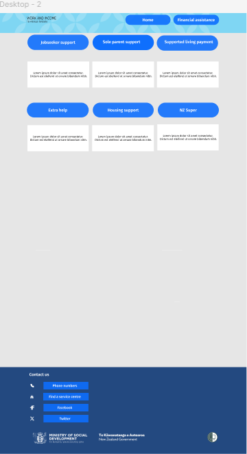
A streamlined MyMSD app, designed with an agile mindset, offers a unified view that organizes all pertinent information under appropriate headings, complemented by one-click solutions—a key aspect of information architecture within design thinking.
Tools
Miro
Figma
Trello
Team
1 UX designer
1 project manager/mentor
My Role
UX design
UX research
Workshop facilitator
Timeline
Overall: 4+ weeks
Discovery & Research: 2+ weeks
Design & testing: 2 weeks
My Design Process
1
Empathize
2
Define
3
Ideate
4
Prototype
5
Test
6
Implement
During my design process I had to understand the problem I am trying to solve and identify what exactly the core issue the user is facing. Then I started thinking about possible solutions by using various tools such as sketching, card sorting using Miro, wireframing using Figma and finally testing it out. I have tried my best to capture and share this journey with you. So let me walk you through.


Customer journey
Customer Journey
I developed a customer journey map to enhance my understanding of how customers discover and engage with our service, aiming to identify areas for improvement. The mapping process highlighted several user challenges and potential enhancements, particularly in the initial landing and search phases. Consequently, we focused on these areas during our design revisions.
The objective of the customer journey mapping was to uncover the obstacles customers face while seeking information and applying for financial assistance.
I scrutinized the stages from the moment they arrive at the MyMsd app to the point of applying for financial aid.
The primary issues identified were the presence of excessive irrelevant information under unrelated headings, leading to considerable confusion. There was a lack of clear guidance on how to proceed with financial aid applications.
My recommendation was to streamline the information architecture, providing a unified view of the topics customers are searching for through one-click solutions.
Through the customer journey mapping, I proposed straightforward design modifications that would separate into two distinct categories: Individuals and Employers or Providers. This would provide clear guidance for each group. Additionally, I introduced new features such as Accessibility and language options prominently at the top of the MyMsd page, fostering an inclusive environment for all customers.

User journey map
User Journey
Keeping the business objectives in focus, I ensured that users could complete an online application and access information seamlessly. To this end, I created a current-state user journey map to pinpoint areas for enhancement. I discovered two major pain points. Addressing these in the new design led to a more efficient experience, boosting overall user satisfaction.
The initial stage was mapped due to significant obstacles faced by clients during the online application process.
The map was tested and validated through sketching and employing tools like Miro, Trello, Kanban boards, and card sorting.
This mapping exercise highlighted the pain points, aiding in the prioritization of the most critical issues to address.
The primary user challenges involved the inability to obtain a client number without reaching out to the contact center or submitting an online request, which takes two working days. Additionally, clients were often confused during the online application process due to the lack of specific applications and reliance on system-generated questions and responses.
The user journey was refined by alleviating the difficulties associated with online applications and client number requests.

Card Sorting

Kanban Board
Card Sorting
To ensure the website's information architecture met user expectations, we conducted three remote card sorting sessions using Figjam. Our objective was to create smaller, more intuitive groupings from the original fifteen product categories. The result was two distinct main categories, each containing four to six subcategories.
The purpose of card sorting was to establish a clear and seamless user path from beginning to end.
I employed the Kanban board technique in Miro/Figjam, categorizing elements as 'must have', 'good to have', and 'nice to have', each assigned a specific color code.
Information was categorized and cards were placed accordingly based on their significance.
This process taught me that compartmentalizing information before assigning significance to products is both easier and more straightforward. It facilitated the removal of irrelevant content from MyMSD and the refinement of the information architecture.
Ultimately, the restructured information architecture has significantly simplified the customer/user journey.
Sketches
The design process commenced with low-fidelity sketches and wireframes to expedite decision-making through visualization, ensuring no time was wasted. These initial sketches drew upon user observations, interviews, business objectives, and heuristic evaluations, all highlighting the need to minimize distractions in the user flow. Throughout the design journey, I revisited these sketches to stay aligned with the core goals and concepts.
The primary aim of the sketches was to facilitate brainstorming and create a more seamless, user-friendly site.
Feedback from customer interviews and observations, along with the analysis of the existing MyMSD page's content, informed the sketches.
During the sketching phase, I developed multiple iterations, with the main variation being the MyMSD page's design layout, ensuring the site's identity remained intact.
Employing the crazy 8 method, I generated numerous solutions, ultimately selecting the eighth iteration, where all necessary information cohesively aligned.
The layout was meticulously organized to prevent users from feeling disoriented or frustrated by inadequate or poorly structured information.
These sketches provided the necessary clarity, solutions, and vision to propel the project forward.


Wireframes
Utilizing Figma, I converted my initial sketches into low-fidelity wireframes and enhanced them by incorporating relevant stock images and text from an existing website. These wireframes were sufficiently detailed to proceed with user testing. After conducting four tests, I made several alterations and advanced to the development of high-fidelity prototypes.
I crafted a high-fidelity wireframe using Figma.
The usability of the wireframe was assessed through testing, highlighting the significance of correctly linking buttons to the corresponding pages or information.
In total, five iterations were completed to achieve the present result.

Next steps
Moving forward with this project, I would focus on improving the main website's landing page and revisiting the information architecture. Additionally, I am keen on implementing a chatbot feature on MyMSD, which will necessitate additional time and resources. To the future designer taking over, I recommend refining the current site to achieve peak performance instead of starting anew, and to further integrate AI technologies.
Learnings
Embarking on my first project, I have gained substantial knowledge about Figma, Miro, and the critical nature of attention to detail. Prior to my foray into product design, I harbored certain misconceptions about design—that it was largely about aesthetics and using pre-made templates. This notion was thoroughly dispelled during my journey. I realized that design is not just about aesthetics; it's a process of thinking and rethinking. The most valuable lesson I learned is that successful design is the result of continuous iteration.


Thank you for reading my case study!
Want to work with me? Feel free to contact me!
Contact me here if you want to collaborate
pradeepmohandas30@gmail.com