
doorknock
“Real Estate Agent Mobile App Key Navigation Design.”
Doorknock is a New Zealand-based platform aiming to revolutionize the real estate market by connecting buyers and sellers of off-market properties.
As a sole product designer for the Doorknock mobile app, my initial focus is on creating a clear and intuitive navigation system. This will empower real estate agents to efficiently access key features, manage properties, and optimize their doorknocking campaigns, ultimately driving increased productivity and lead generation.
Tools
Miro
Figma
Sketch
Canva
Team
1 Product designer (me)
1 Project manager- Mr Tim Hall
1 Business Analyst- Ms.Dua Akhund
My Role
UX design
UX research
Workshop facilitator
Timeline
Overall: 16 weeks
Discovery & Research: 8 weeks
Design & testing: 8 weeks
Context
After an initial discussion with stakeholder Mr. Tim Hall and agents, it was observed that the doorknock agents and the business were relying on an Excel sheet for their operations. The business owner recognized this as a problem due to its inefficiency and time-consuming nature. Similarly, the agents found the Excel sheet unsuitable for their needs. This led to the decision to transition from a manual Excel sheet to digital solutions, creating the need for an agent app.
As a business, they were unsure of the key features they required in an app. I was assigned the task of designing the key navigation from the ground up.

Doorknock property list excel sheet
Business problem
-25%
Decrease in agent productivity
Real estate agents using existing Excel sheet experience a 25% decrease in productivity due to inefficient navigation and fragmented access to critical features. This validates the business need for a digital solution with seamless navigation.
$50,000 per year
Increased operational cost in administrative salaries
Reliance on inefficient Excel sheets for operations has led to increased operational costs, with an additional $50,000 per year in administrative salaries. This validates the business need for a digital solution where administrative work is drastically reduced.
-5%
Decrease in deal closure rate
Inefficient Excel based operations have caused a 5% decrease in deal closure rates for Doorknock agents. This validates the business need for a digital solution that enables them to close deals at a much faster rate.
Customer (Agent) problem
-15 %
Decrease in successful appointment rate
The reliance on inefficient Excel sheets for operations has resulted in a 15% decrease in successful appointment rates for Doorknock agents, hindering their ability to effectively schedule and meet with clients. This validates the agents need for a digital solution that enables them to see their tasks clearly.
-10 %
Decrease in commission earnings per month
The use of Excel sheets for operations has led to a 10% decrease in monthly commission earnings for Doorknock agents, directly impacting their income due to delays and missed opportunities. This validates the agents need for a digital solution that allows them to see their potential leads.
2 hours per day
Average time spend by agents on data entry
Doorknock agents spend an average of 2 hours per day on manual data entry using Excel sheets, significantly reducing the time available for client-facing activities and deal-making. This validates the agents need for a digital solution that allows them to update details at the click of a button.
My Design Process
Stakeholder interview to understand the business expectation
I initiated the project by arranging an interview with the stakeholders. I organized my questions into three distinct categories: Company/Team, User, and Product. This classification aimed to gain a comprehensive understanding of the business's concept, its users, and the product. It was essential to discern the unique problem they are addressing in the market and what specifically needs to be designed.

Stakeholder Interview Questions
Video-Stakeholder Interview with Tim Hall
Key insights from stakeholder interview
Following interview with Doorknock founder Tim Hall, several critical business objectives and constraints were identified. Stakeholder emphasized the need for a navigation solution that:
Increases Agent Productivity: Reduces time spent on non-selling activities, allowing agents to focus on revenue generation.
Reduces Operational Costs: Minimizes administrative overhead associated with manual data management and agent support.
Improves Customer Experience: Ensures consistent and professional service delivery, enhancing Doorknock brand reputation.
Integrates Seamlessly: Works flawlessly with existing Doorknock systems and data sources.
Is Scalable and Maintainable: Can accommodate future growth and evolving business needs.
Key constraints included budget limitations, a tight timeline for implementation, and the need for a solution that is easy to learn and use for agents with varying levels of technical expertise. The interviews confirmed the significant impact of the current manual navigation process on agent efficiency and highlighted the potential for a well-designed navigation system to drive significant business value.
Based on these insights, I prioritized features that directly address agent productivity and ease of use, while also considering the technical constraints and business objectives outlined by stakeholders. The next step is to conduct user research to identify the key features for real estate agents’ success.
User research: Identifying key features for real estate agent success
Research Methods: To understand the needs and pain points of real estate agents, I conducted the following research methods:
Contextual Inquiry: Observed real estate agents in their natural work environment to understand their workflow.
User Interviews: Interviewed 5 real estate agents who specialize in off-market properties.
Analysis: Analyzed 3 existing real estate apps and websites to identify their strengths and weaknesses.

User Interview Observations & Insights while using excel sheet
Summary
What did I do? Conducted semi-structured interviews with 5 real estate agents specializing in off-market properties. I also performed a workflow analysis, observing agents as they searched for and managed off-market property information.
Why did I do it? To gain a deep understanding of the agents' needs, pain points, and existing workflows. This was crucial for identifying the key problems the app needed to solve.
What was the result? Identified key pain points, including:
Time-consuming manual searching for off-market properties.
Lack of a centralized platform for communication and task management.
What did I learn? Agents were overwhelmed by the fragmented nature of the existing process. A centralized, mobile-first solution was highly desired.
A survey of 20 agents revealed that 75% spend more than 5 hours per week searching for off-market properties.

Comparative analysis to identify opportunities for improvement and innovation in my own design
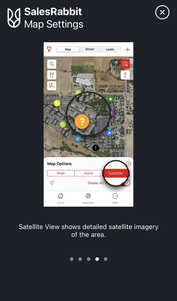
Following the stakeholder interviews, I collaborated with my mentor to unpack the wealth of information obtained. We pondered over key questions: What problem are we solving? What should we design? How do we keep agents engaged with the platform? Are there any inspirational companies in this domain? Who are our competitors, or who do we benchmark against? This led to an exploration of companies like Ostrich, Sales Rabbit, and Realestate.co.nz.
Ostrich's business model served as an inspiration, Sales Rabbit's mapping feature was captivating, and Realestate.co.nz provided a wealth of information. Each company offered unique elements worth emulating.
With these insights, I began visualizing the user flow for the Doorknock agent portal, using the aforementioned sites as benchmarks.


Detailed Findings:
The comparative analysis revealed that existing apps often lack robust filtering options and a user-friendly map interface. Furthermore, their business concept differs from Doorknock, which positions them as non-direct competitors.
Doorknock should prioritize a mobile-first platform with offline access, robust lead and territory management, and team tracking. Key differentiators include integration with local NZ data, map-based visualization, and gamification to motivate sales teams. Future innovation should focus on AI-powered lead scoring and community features to enhance efficiency and engagement.
Empathy map to gain deeper understanding
I created an empathy map to gain deeper understanding of users by visualising their thoughts, emotions, behaviours, and pain points.

Empathy Map to gain deeper understanding
Quote: "One agent stated, 'I spend hours every week just sifting through different websites and databases trying to find off-market properties. It's incredibly frustrating.”
User needs- to understand what exactly they need
From the empathy map, I documented the emotional states of the users, which enabled me to identify their needs and propose the following potential features:
Property List: Ability to view a list of off-market properties and their status in New Zealand.
Account/Doorknock Credits: Ability to purchase and top up credits easily within the app.
Task/Plan My Journey: Ability to plan their day or journey directly in the app.
Dashboard: Ability to view important data in a single, consolidated view.
User Personas to guide design decisions and create user-centered solutions
Based on the empathy map, I created two user personas: Heather, the 'Experienced Agent' who values efficiency, and Gemma, the 'New Agent' who needs guidance and support. (see pic below). I focused on user persona to
Ensure design decisions are aligned with real user needs.
Help prioritise features and improve user experience.
Facilitate better communication between designers, developers, and stakeholders.

User Persona- Real Estate Agent- Heather- Experienced Agent

User Persona- Real Estate Agent- Gemma- New Agent
User Story- to create a shared understanding of what we are building and why.
Once the personas was completed. I began working on the user story to:
to keep the development user focused.
help me prioritise features
Improve collaboration between designers, developers & stakeholders.
Ensure product market fit.

User Story indicating potential desired features i.e. key navigation
The biggest problem
“What are the key features that need to be designed for doorknock agent app”
Problem statement
Doorknock needs to define and prioritize the core features for its platform to effectively empower real estate agents in New Zealand. The challenge lies in creating a solution that balances essential functionality with unique differentiators, addressing the specific needs of the local market while remaining user-friendly and competitive against established players. Without a clear focus on the right features, Doorknock risks developing a product that is either incomplete, overly complex, or fails to resonate with its target audience.
Possible Solution
Based on insights derived from user research, empathy mapping, and user stories, all indications pointed towards a potential solution involving a key navigation bar comprising Dashboard, Area, Task, and Account. To validate this, I proposed 1 hypothesis, which I have further explained in this case study.
Success measure
Increased user adoption and active usage of the platform by real estate agent in New Zealand.
Improved sales performance metrics (e.g., lead conversion rates) for teams using Doorknock.
Positive user feedback and satisfaction scores, indicating that the platform effectively addresses their needs and provides a valuable return on investment.
Competitive differentiation, demonstrated by unique features and a strong market position within the New Zealand real estate landscape.
Task
To begin with I came up with 1 hypothesis i.e. to design an agent portal for a mobile app where:
The navigation bar is appealing and facilitates key interactions for agents.
Approach
Iterative Usability Testing, for e.g. Initial Usability Testing (Qualitative). This helps identify major usability issues and areas of confusion quickly. It provides rich qualitative data that you can't get from analytics alone. Small sample sizes are effective for uncovering significant problems.
Summary
What did I do? Based on the user research and the problem to be solved, I formulated one key hypothesis about the app's design and functionality:
Why did I do it? To provide a clear framework for the design process and ensure that every design decision was aligned with the user's needs.
What was the result? The hypothesis provided a clear direction for the design and testing phases.
What did I learn? Formulating clear and testable hypothesis at the outset of the project is crucial for a focused and efficient design process. Next time, I would involve the business owner and business analyst in the hypothesis generation process to ensure alignment with business goals.
User flow to visually map out the steps a user takes to complete a specific task within a product and to optimize user experience
I began by referring to the existing user personas and the detailed user story. With the user story in hand, I started sketching the user flow, ensuring it aligned with the app's goals and user needs.

Dashboard

Task

Account

Area
Card sorting to prioritize features in dashboard
To finalize the Dashboard option, I organized a collaborative activity involving the Product Owner Mr. Tim, Business Analyst Ms. Dua and Mentor Mr Seann. The activity was inspired by the card sorting technique: participants were tasked with selecting 6 items from a shortlist of 9 items and arranging them within a mobile frame—all within a time limit of 3 minutes. (see pic Activity)

Card Sorting Activity for Dashboard

Card Sorting Activity for Dashboard

Card Sorting Activity for Dashboard
Outcome:
Following the activity, I facilitated a discussion to understand the rationale behind each participant's choices. This step provided valuable insights into their priorities, preferences, and reasoning, which significantly informed the final Dashboard design.
This exercise not only streamlined the decision-making process but also ensured the Dashboard aligned with the needs and expectations of key stakeholders.
Sketching to shape prototype for MVP
With the user flow finalized, I began sketching the app layout to align with the defined structure (see pic - sketching). To kick off the process, I utilized the Crazy 8 method, a rapid ideation technique, to generate multiple design concepts in a short period of time.
This approach allowed me to explore creative and unique ideas quickly, ensuring that the app design was innovative while adhering to the established user flow.

Crazy 8 Method- Area

Account

Area

Area/Task/Dashboard
Mockups/ Interactive Prototypes to test the hypothesis/key features
After completing the sketches, I transitioned directly to prototyping due to time constraints. I began with a low-fidelity prototype that was reviewed and refined through weekly meetings with the Product Owner after each iteration.
Initially, the prototype included a large number of screens, with new screens created for almost every action. This approach, while thorough, made the design overly complex. Through successive iterations, I streamlined the flow, enhancing the prototype to create a more seamless and user-friendly version.
Ultimately, the refined design evolved into a high-fidelity prototype, which provided a polished and comprehensive representation of the final product.

Sign in page

Dashboard

Area-Map & Status

Area-Map & Status

Area -Map & Status

Area- Plan your Route

Area- Plan your Route

Area- Plan your Route

Task- Today’s Task

Account- My Profile

Account-Doorknock Credits

Account- Onboarding Video
Summary- UX/UI
What did I do? Designed the user interface and user experience for the mobile app, focusing on simplicity, efficiency, and ease of use. This included creating mockups, and interactive prototypes.
Why did I do it? To create a visually appealing and intuitive interface that would encourage adoption and maximize user satisfaction.
What was the result? Developed a high-fidelity prototype with a clean and modern design, featuring a centralized dashboard, advanced filtering and search capabilities, integrated the excel sheet features into the app.
What did I learn? Prioritizing a mobile-first design approach was essential for meeting the needs of busy real estate agents. Next time, I would explore incorporating more gamification elements to further enhance user engagement.
Demo Video
Summary -Prototyping:
What did I do? Developed interactive prototypes using Figma to simulate the user experience and test design concepts.
Why did I do it? To gather user feedback early in the design process and identify areas for improvement before investing in development.
What was the result? Created a functional prototype that allowed users to navigate the app, search for properties, buy and top-up doorknock credits, filter properties as per their status, update property status, add task and have a single view dashboard.
What did I learn? Interactive prototypes are invaluable for gathering realistic user feedback and identifying usability issues. Next time, I would create multiple prototypes with different design approaches to compare and contrast user preferences.
Usability Testing to evaluate how easily and effectively users can achieve specific goals while interacting with a design
I finally started testing my prototype by conducting user testing sessions. We had 5 different participants from different backgrounds:
Midori - Real estate agent
Shivam- IT Consultant
Tim/ Andrew- Product Owner/ Senior Designer
Brad- Real estate agent

User Testing with Andrew/ Tim

User Testing with Brad

User Testing with Midori
User Testing key navigation with Andrew/Tim
User Testing key navigation with Brad
Summary- User Testing
What did I do? Conducted iterative usability testing sessions with 5 real estate agents, using the interactive prototype. I observed users as they performed key tasks, such as their understanding of key navigation, searching for properties, updating status.
Why did I do it? To validate the design hypothesis and identify areas for improvement based on real user feedback.
What was the result? Identified key usability issue:
1. The navigation bar was not intuitive enough.
What did I learn? Iterative usability testing is essential for identifying and addressing usability issues early in the design process. Next time, I would conduct more frequent usability testing sessions with a larger and more diverse group of users.
Observations to gather insights into user behavior and identify usability issues
This is how I captured the feedback from users (refer to pic below). Upon completion of the user testing, I compiled all the feedback for each task and categorized them accordingly (refer to pic -in circle).


User Feedback

User Feedback
Task 1A- Agent login and sign-up flow
Feedback Summary:
“The login and sign-up page is found to be quite straight forward and user friendly.”
Feedback collected:
Login process is easy and simple to collect.
Too much info to fill up on profile form.
Users suggest not to have upload photo as doesn’t feel comfortable.

User Feedback
Task 1B- Comprehension of navigation bar function
Feedback Summary:
“User is clear with each section of navigation bar however clarity of job to be done is required.”
Feedback collected:
Users don’t know what to do on landing on area page.
Users find irrelevant information on list view such as land/floor area.
Users would like to see potential leads on landing on area page.
Users would like to have an accurate map.
Users don’t understand the purpose of having task and calendar in navigation bar.
Users understand the dashboard and how to use doorknock credits.
Doorknock leads are value for money.

5.3 Analytics
100% of the user found the dashboard easy to understand.
100 % of the users found the login and sign-up page to be quite straight forward and user-friendly.
80 % of users is clear with each section of navigation bar however clarity of job to be done is required.
80 % of users understand the doorknock display (summary & tiers) however not sure why to pay for doorknock.
100 % of users found it easy to buy & top up doorknock credit.
80 % of users sees the potential of map in showing the leads however needs clarity in icon and status bar.
80 % of users understands how to use the map to plan his route however it is not clear how to add multiple properties to the route planning.
60 % of users understands the purpose of having spreadsheet however having confusion on certain terms to reflect the status of the property. Some even say it is redundant.
Implement to translate a design into a functional product
After going through the user feedback, I iterated my prototype for the final time and started preparing for my playback to stakeholders. I had broken down the feedback for each task from all users and presented it to stakeholders along with the amendments made to the final design (see below). I did propose my design proposition in my final playback (see pic below). Later on, I handed over the project to the next designer to takeover and further scope the project.
Based on hypothesis: Navigation bar is appealing & meets the agents key interaction.
The general feedback from users indicated that too much information was being requested on the My Profile page (see pic Before), and that uploading a photo should not be mandatory when initially creating a profile. Based on this feedback, I redesigned the My Profile page and made uploading a photo optional (see circled After).
Before

Account-MyProfile

After
Account-My Profile
Impact:
100 % of the users found the login and sign-up page to be quite straight forward and user-friendly resulting in 20% increase in real estate agents signing up with doorknock.
As the user was unclear about what to do on landing Area page (see pic Before) and was unsure how to locate the doorknock leads, I redesigned the Area page with a pop-up message box “click any doorknock to continue” and displayed potential doorknock leads on the area page (see pic After). Next, I renamed the "status" button to "sort by" as suggested by the majority of users and renamed further options under "sort by" to homeowner, do not disturb, and already for sale (see pic After) as the options were confusing for users.
Property Status Color-Coding for Enhanced Visual Clarity
One of the key design challenges was to make it easy for agents to quickly identify the status of properties on the map. To address this, I implemented a color-coding system:
Green: Doorknock delivered successfully
Yellow: Delivery unsuccessful
Dark Pink: Needs to be delivered
Rationale: My user research indicated that agents frequently scan the map to identify properties with specific statuses. Color-coding allows them to do this at a glance, saving time and improving efficiency.
Accessibility Considerations: To ensure accessibility for users with color blindness, we used distinctive colors to differentiate. For instance, a property where doorknock has been “Successfully delivered” has an eye drop with green background, while a property where doorknock “Needs to be delivered” has an eye drop with a dark pink background, while yellow for “Unsuccessful delivery”. We used a color blindness simulator during the design process to verify that the color choices were distinguishable for individuals with different types of color vision deficiency.
Iteration: In initial usability testing, we found that some users struggled to distinguish between the "Successfully delivered" and "Unsuccessful delivery" colors in bright sunlight. As a result, the eye drops were changed to just two colors, pink and green, to increase the contrast, avoid confusion and improve visibility.
Before

Map & Status
After

Map & Status
Impact:
100% of users able to see the potential leads and able to filter properties as per their status, resulting in 20% increase in agent satisfaction by intuitively navigating design.
Under "Plan your Route," the user was clear on how to use the feature but was not clear on how to add multiple properties to the route planning. Therefore, I designed an "add more" feature in the tile view (see circled pic After) and added a "Selected" feature in the list view. This allows the user to see how many properties have been selected to add to the route planning. Thus, making the usability seamless.
Before

Area- Plan your Route
After

Area- Plan your Route
Impact:
Improved navigation efficiency by 30%, increasing route-planning usage by 30% by integrating user-friendly features.
Users were unclear about the purpose of purchasing doorknock credits under the Account (see pic Before). Therefore, I reorganized the layout by moving the doorknock summary to the top so that users can see the balance and be prompted to buy doorknock credits (see circled pic After). Previously, even after purchasing the doorknock credits, the purchase summary was at the bottom plus the term “delivered”, which caused confusion regarding the success of the purchase transaction. Thus, I moved the doorknock purchase summary to the top and reworded “doorknock used” instead of “delivered” (see circled pic After).
Before

Account- Doorknock credits
After

Account-Doorknock credits
Impact:
100 % of users found it easy to buy & top up doorknock credit. Enhanced user experience, increasing credit purchases by 30% through developing a seamless top-up system.
Summary- Iteration & Refinement:
What did I do? Refined the design based on the feedback gathered during usability testing. This included:
1. Redesigning the navigation bar to improve usability.
2. Simplifying the credit purchase process.
3. Improving the user-friendliness of the 'Plan-Your-Route' feature.
Why did I do it? To address the usability issues identified during testing and create a more user-friendly and effective app.
What was the result? Created a refined prototype that addressed the key usability issues and provided a more seamless user experience.
What did I learn? Being responsive to user feedback and willing to iterate on the design is crucial for creating a successful product. Next time, I would involve the development team in the iteration process to ensure that the design changes are technically feasible.

Login page
Impact
100 % of the users found the login and sign-up page to be quite straight forward and user-friendly resulting in 20% increase in real estate agents signing up with doorknock.
100% of users able to see the potential leads and able to filter properties as per their status, resulting in 20% increase in agent satisfaction by intuitively navigating design.
Improved navigation efficiency by 30%, increasing route-planning usage by 30% by integrating user-friendly features.
100 % of users found it easy to buy & top up doorknock credit. Enhanced user experience, increasing credit purchases by 30% through developing a seamless top-up system
Outcomes & Lessons Learned:
Outcomes: The project resulted in a functional mobile app prototype with a user-friendly interface and streamlined workflow. The prototype demonstrated the potential to significantly improve the efficiency and effectiveness of real estate agents specializing in off-market properties.
Lessons Learned:
Iterative usability testing is essential for identifying and addressing usability issues early in the design process.
A hypothesis-driven design approach provides a clear framework for the design process and ensures that every design decision is aligned with the user's needs.
Prioritizing a mobile-first design approach is crucial for meeting the needs of busy real estate agents.
Being responsive to user feedback and willing to iterate on the design is essential for creating a successful product.
Recommendations
Profile:
Explore the option to further ease the sign in process by having a fingerprint sign in (touch scan) where the app captures all the data and prefills information from the existing phone.
If the business wants to capture more user information then some motivation is required, such as door knock credits.
Include the pain points/reasons why one should use the app.
Offer the option to upload a photo/ facial recognition or skip the step.

Account>My Profile
Area:
Steps to be highlighted on the area page:
Remove land/area information. Agents only need to know the number of bedrooms and bathrooms.
Display potential leads on the area page, with an option to view nearby leads.
Revise the letter's wording and reconsider the business concept to maintain agent motivation.
Design a user-friendly, area-specific map with clear icons and status indicators, omitting the radius since agents have assigned areas. Propose visibility rules for the map and display clear steps for seamless navigation.
Streamline the 'plan your route' page to allow easy selection of multiple properties, adding them to a list, and showcasing nearby leads for door knocking

Area
Account:
The onboarding video should comprehensively cover all app features, including the door knock display, and present the information architecture of the doorknock credit page. Instruct the video editor to prioritize the summary before the purchasing options.
Simplify terminology by changing "Status" to "Sort by," and clarify the presentation of the doorknock credit summary. Change the term "doorknock delivered" to "doorknock used" under the credit summary.
Ensure the onboarding video is played upon first login.
Offer a quick buy option exclusively on the Area page and suggest cross-selling opportunities, such as topping up door knock credits while exploring other territories.

Account>Doorknock credits

Dashboard
Handover
I would like the next designer to focus on the most important features of the Doorknock app, specifically the Area page, Task, and making the Dashboard livelier. Additionally, the hamburger menu on the Dashboard should be revisited, and attention should be given to the notification bell. Below is the list of tasks for the next Product Designer:
The look and feel of the Dashboard need to be addressed to make it more lively.
The hamburger menu on the Dashboard needs to be revisited. The user should be able to access the hamburger menu from any page, not just the Dashboard. Focus on the appearance of the page when the user selects any options from the Dashboard hamburger menu.
Consider the notification bell icon - whether it should be on each page or just as a number at the top corner of the hamburger icon.
My suggestion is to remove the task option from the navigation bar as it is not serving any purpose at this stage of the project. It can be added in the future if necessary.
Consider which pages should have Quick Buy options.
Create an onboarding video to cover Doorknock display (tiers) and purchase.
The Area page map needs to be polished. Refer to Sales Rabbit, Realestate.co.nz, and Ostrich Real Estate for inspiration. If needed, redraw the map from scratch. Focus on the Plan Your Route page and take inspiration from Uber. Refine every click on the Area page.
Under Doorknock summary, consider what the purchase history should look like.

Handover of Design
Learnings and Personal Growth
This project has been a transformative journey, teaching me to manage a product through its entire lifecycle using the design thinking process.
I gained hands-on experience in user research, sketching, prototyping, testing, and implementation—skills that have strengthened my foundation as a Product Designer.
Beyond technical expertise, this project has profoundly impacted my personal growth. It taught me patience, resilience, and the value of viewing challenges as opportunities. Applying the design thinking process to everyday life has reshaped my perception: I no longer see problems as obstacles but as chances to innovate and grow.
Working on my first mobile app project was both challenging and exhilarating. It expanded my skill set and deepened my appreciation for collaboration and innovation within the dynamic Doorknock team.
This experience has left me with immense gratitude, not just for the chance to work on such a unique project but also for the lessons it offered. With a renewed Agile mindset, I am now more at ease tackling problems, knowing that solutions are always within reach. I look forward to embracing more learning opportunities in the future.

Product Owner Feedback
Product Owner & Founder- Tim Hall
Thank you for reading my case study!
Want to know more about this case study or work with me? Feel free to contact me!
pradeepmohandas30@gmail.com